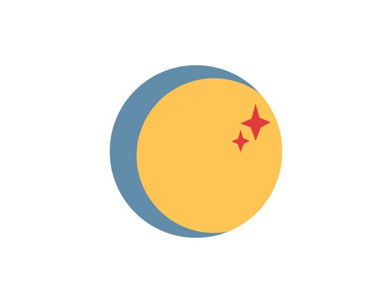
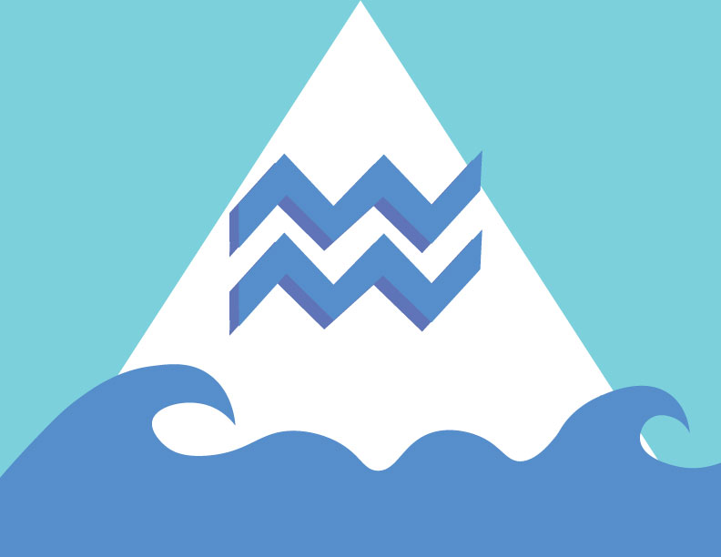
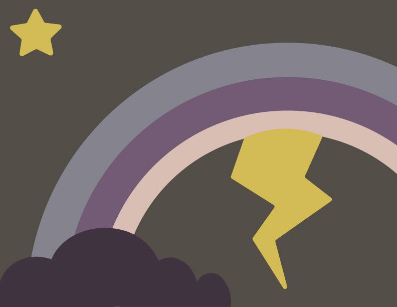
This flag incorporates a sun and a moon formed together into a single circle, and then 2 little red stars are inside the sun. This flag is simple and I drew inspiration from the Japanese flag and added some astrological elements. This flag has the Aquarius zodiac sign in front of a white triangle and blue waves at the bottom. Aquarius in the water-bearer but it is also an Air sign, and the simple symbol for air is a triangle.This flag has a tri-color rainbow with a lightning bolt and a star in the top left. I love storms and I think they can be very beautiful in a lot of ways.This flag is of a sunset and a palm tree in front of it. I love the beach and grew up on the east and west coasts so I wanted to design a flag that would connect with any beach bum.Finally, I created this flag for my Animal Crossing town. The town’s name is Honeydew and it is on an island, so the flag incorporates a sun and a big honeydew melon right. in the center. This is my personal favorite.
I really like your flag design of the sunset and the palm tree. The color scheme you decided to use is perfect. I immediately get a feel of a warm sunset. I also like how the color scheme is kind of monochromatic, it gives off simplicity that really fits with your design. Your choice in shades on orange/yellow go well together. I like how the brown has hints of orange and red to it.
The palm tree is a unique shape. I like how it is not the same as the ordinary, basic palm tree shape. One recommendation I have for the palm tree is to move down the coconuts a little more so they have more of a distinguished shape. The composition is symmetrical which is really cool and adds some order to the design, it is very fitting for it being a flag. Looking at your designs on your previous post, this is definitely my favorite way to relay the beach.
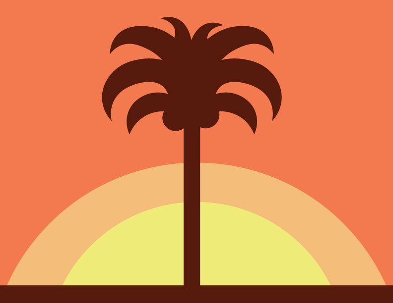
LikeLike