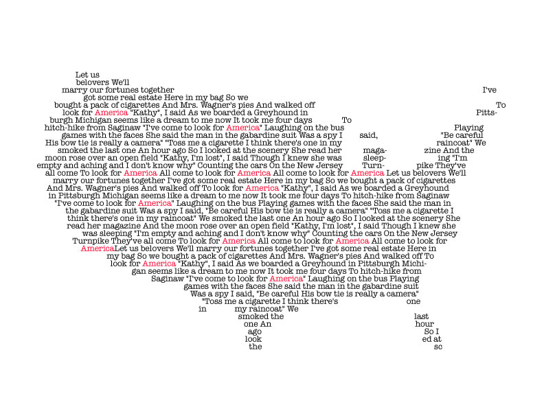
I really like your America calligram. The shape of the country is accurate and well represented. The font you chose is very nice, it kind of reminds me of a type writer. I like how you changed the words “America” to be red and how each “America” is spread out enough so it is balanced. It really emphasizes the theme of America. Great work!
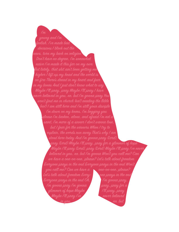
I really enjoyed the composition of the prayer one. I think picking a subtle color such as pink creates a calming ominous vibe which is what the act of praying is made to be. One thing I would possibly change is the text color. I like that it is a light pink to tie into the shape background however, I think it would be more visually legible if it was a couple of shades lighter.
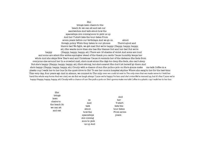
Your Calligrammes look really nice, I especially love the America one and the Cloud one. Your choice to highlight “America” in your text was really effective and drew attention to it without it detracting from the rest of the piece. The cloud looks really nice as well, you kept your shape simple and identifiable, and choosing such a simple shape allowed for your text to be larger and still be able to be read.

I really like your America calligram. The shape of the country is accurate and well represented. The font you chose is very nice, it kind of reminds me of a type writer. I like how you changed the words “America” to be red and how each “America” is spread out enough so it is balanced. It really emphasizes the theme of America. Great work!
LikeLike
I really enjoyed the composition of the prayer one. I think picking a subtle color such as pink creates a calming ominous vibe which is what the act of praying is made to be. One thing I would possibly change is the text color. I like that it is a light pink to tie into the shape background however, I think it would be more visually legible if it was a couple of shades lighter.
LikeLike
Your Calligrammes look really nice, I especially love the America one and the Cloud one. Your choice to highlight “America” in your text was really effective and drew attention to it without it detracting from the rest of the piece. The cloud looks really nice as well, you kept your shape simple and identifiable, and choosing such a simple shape allowed for your text to be larger and still be able to be read.
LikeLike