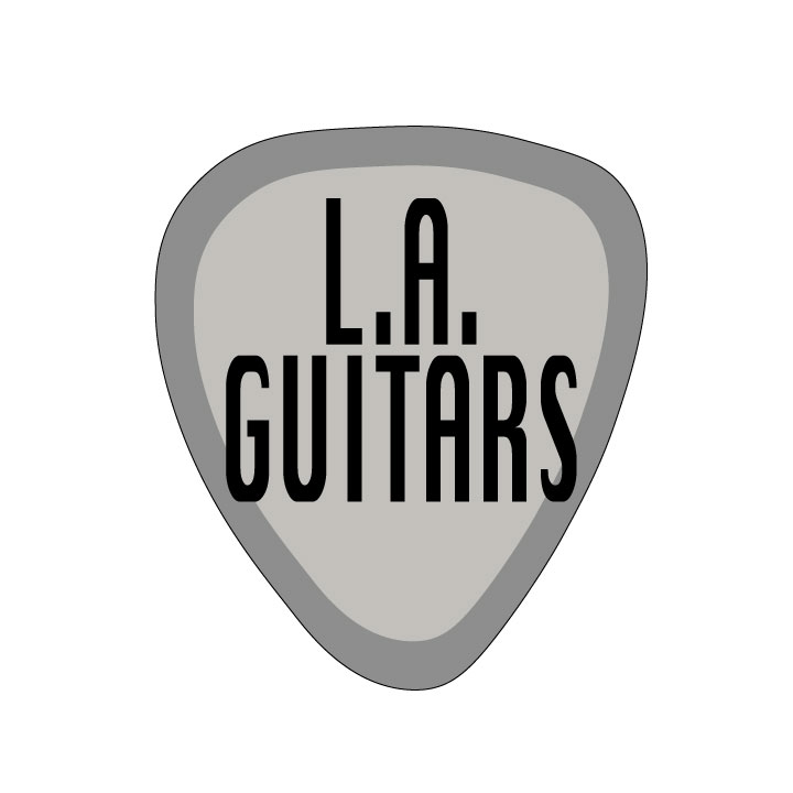
I play guitar and love making music so the main shape of this logo is a guitar pick. I also love visiting LA and I am from California.

I collect vinyl records so I wanted to create a sign you might see in a record store.
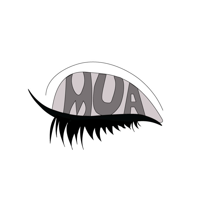
I really love makeup and creating makeup looks so this logo would be used on like a website or youtube channel for a makeup artist.
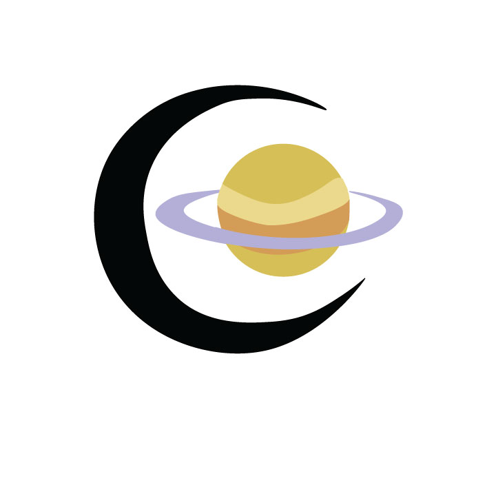
I love astronomy and astrology so I made this cute little moon and saturn logo.
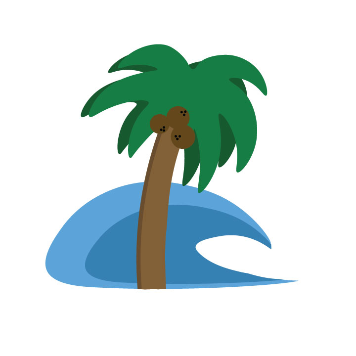
I grew up in California and Florida so I’ve always been around the beach and palm trees, so thats why i made this logo.
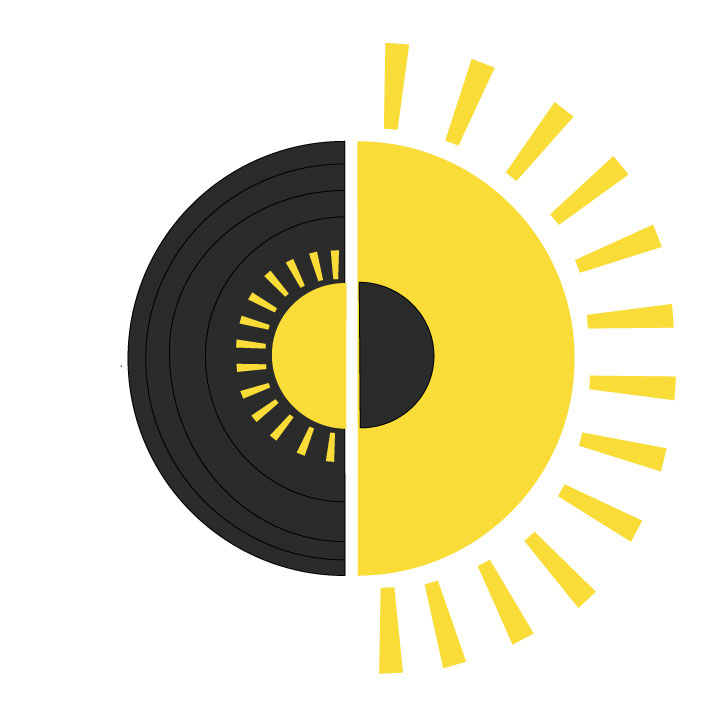
Another idea for a record store logo but with some added sunshine, maybe the store is in Florida.

All your logos are so cute!! I especially love the moon and Saturn logo, the way you combined them works so well. I also really like the half record, half sun logo, its very appealing and interesting to look at.
LikeLike
I really like your record logo. I like how each half of the logo is inverted (I don’t know if that’s the right word; the sun being in the record and the sun having some black in the middle). I also really like how the sun in the record matches the sun perfectly. The lines in the record do not appear equal distance on the top and bottom, if that makes sense. I suggest to try to make the lines have the same amount of space between each other (the top is wider than the bottom).
LikeLike
I like the contrast between the color and the black and white designs of the logo. The color ones have a clean edge to them, making them feel very simplistic, even if there is a fair amount going on. On the other hand with the black and white logos, you can see the rougher, less clean, edges on them, showing that they have a good level of craftsmanship and heart behind them. I enjoy each design of logos for they all are unique, yet personal.
LikeLike
makeup one- I really enjoy the fact that you incorporated makeup and what you use makeup on (an eye) in a logo. The eye is extremely well done. The lashes are intense and are specifically intense because of the dark black. Your initials in them (I think that may be what the letters are?!) add a personal touch. The contrast of the lid versus the lashes make it bold and true to what it actually is.
LikeLike
I really love how all your logos have a similar style to them. The one with the moon and saturn is my favorite because the contrast of the colored planet and the black moon. Also, I don’t know if you did this on purpose, but I like how the moon’s edges aren’t completely smooth, it feels more personalized.
LikeLike
I really like the illustrations of these logos. Most of them use simple shapes and colors to create a more in-depth product. I like the use of using lighter or darker colors for shadowing and highlighting as well.
LikeLike
The palm tree logo is very well done. I like that the simple shapes can be put together to look so clean. I try to have a similar style with my work.
LikeLike